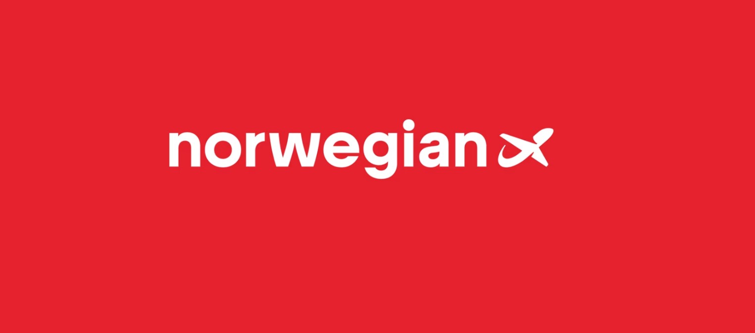

Norwegian Air has refreshed its logo and visual identity in 2024, marking the airline’s first major brand update since its founding in 2002. The redesign introduces a modernized color palette, updated typography, and a simplified version of the airline’s iconic red-and-white branding.
According to Norwegian, the new visual profile aims to create a warmer, clearer, and more contemporary expression while preserving the familiar look that customers recognize. The update includes a brighter red tone, a refined wordmark with subtle typographic adjustments, and a more flexible layout system designed for digital-first communication.
The airline stated that the refresh aligns with its long-term strategy to strengthen brand recognition and support its ambition to become Europe’s most loved and trusted airline. Norwegian will begin rolling out the new identity across digital channels first, followed by gradual updates to airports, offices, marketing materials, and aircraft. During the transition period, the old and new branding will coexist.
The redesign was developed by Norwegian’s internal marketing team in collaboration with Try Design, with creative direction led by Camilla Aspen.