

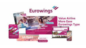
Eurowings has revealed a comprehensively revised corporate design that reflects the airline’s evolution from a classic low-cost carrier to a European value airline, translating its brand essence “More ease for everyone” into a cleaner, more consistent visual identity.
At the heart of the new look is the Wings logo mark, which will now play a more prominent role as an emotional design element across campaign visuals, moving-image formats, and digital interfaces, evolving from a standard logo component into a defining brand symbol. The signature Eurowings Burgundy colour is retained, with a more dynamic use of gradients and transparency adding flexibility to the visual system.
A newly developed custom typeface, Eurowings Type, has been created specifically for the brand and is designed for optimum legibility across digital and physical applications. The Eurowings logo has also been simplified and will appear in a more reduced form going forward.
The redesigned system places particular emphasis on digital clarity, with simplified navigation structures and inclusive, accessibility-first design across the airline’s website and app. The overall design reduces complexity across all touchpoints, from booking through to arrival at the airport and on board the aircraft.
“With the new corporate design, we are making our brand essence ‘More ease for everyone’ visually tangible,” said Dirk Otto, Head of Marketing at Eurowings. “At the same time, we are creating a modern and consistent brand presence that sets us apart and further strengthens our recognisability.”
The rollout will take place gradually across all channels and was developed with digital agency Oscar Bravo, a Lufthansa Group company. Eurowings Type was designed in collaboration with type designer Hannes von Döhren.


